Sera Prognostics & PreTRM
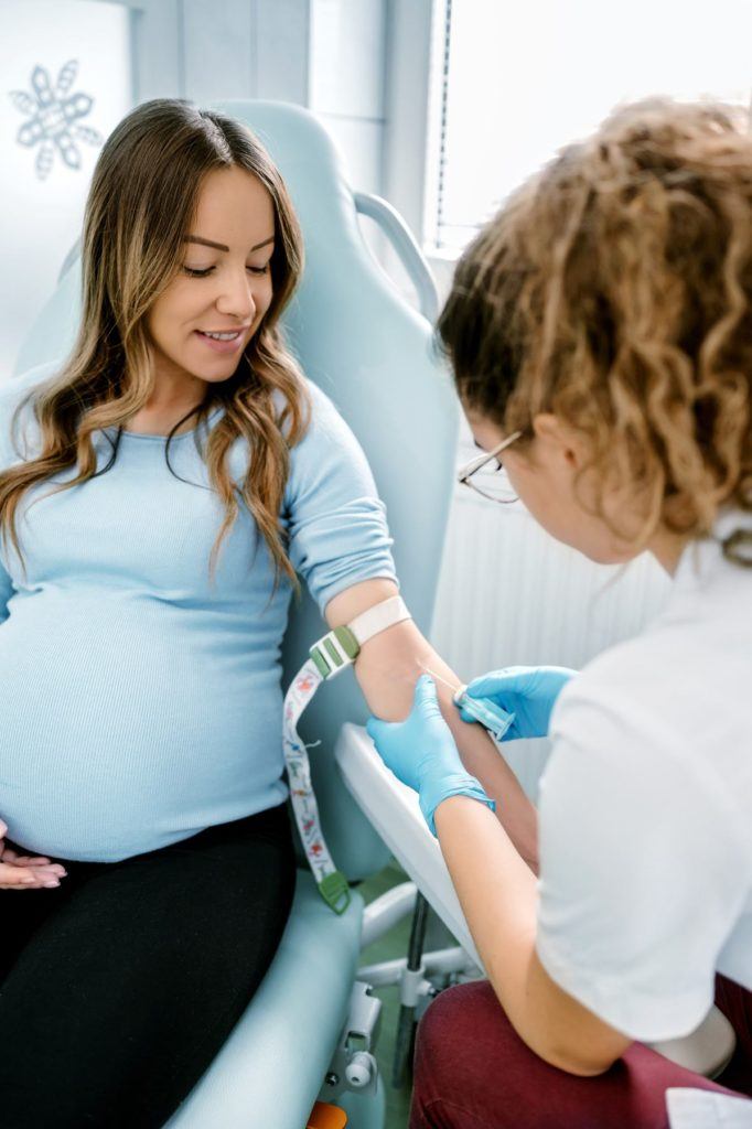
Sera Prognostics aims to be a global leader in high-value women’s health diagnostics, delivering pivotal information to physicians to improve the health of pregnant women and newborns, and to simultaneously improve their health economics. The PreTRM Test is the only clinically validated commercially available blood test that provides an early, individual risk assessment for spontaneous preterm birth in asymptomatic, singleton pregnancies.
We partnered with Sera Prognostics on messaging, brand definition, logo and website redesign, as well as digital marketing across the board. Our team at emagine and the team at Sera Prognostics were honored to accept the 2022 MarCom Gold Award for this important project.
View the award-winning websites here: seraprognostics.com & pretrm.com


Defining the Brand:
Sera Prognostics’ PreTRM Test is based on ground-breaking blood biomarker-based testing aimed at addressing preterm births, a serious medical challenge. The current methods of detection for preterm births were woefully deficient.
Sera was at the point of moving from discovery and science to commercial market reality when emagine got involved. Strategists at emagine partnered with both Sera Prognostics (as the parent brand) and PreTRM (the product brand) to first deep-dive into their three primary audiences – patients, providers, and payers.
Through a series of workshops with Sera & PreTRM, emagine strategists charted a brand trajectory, moving from educational and factual to focusing on the patient and expanding to a more emotion-based story that then extended to HCPs.


“We conducted in-depth qualitative interviews, both internal and external, with the three primary audiences to create detailed personas, capturing information across six key parameters. Following persona development, we created journey maps across three phases to capture the content that each persona is specifically looking for at a given phase.”
David Hubbell, emagine Director of Strategy


Developing the Message:
Following the brand analysis and definition phase, emagine conducted a position & messaging workshop where it was agreed to make the brand story about HCPs and patients as the true heroes working together. Strategists developed a three-part brand story aimed at each audience and the messaging featured on the site’s home page.
Design:
emagine’s Design Team was tasked with three broad areas:
Develop Brand Guidelines

Corporate Website Design (Sera Prognostics)

Product Website Design (PreTRM)

Logo Design:
emagine designers investigated different options for how to tie in the corporate brand of Sera Prognostics with the product brand of PreTRM and built a variety of design concepts for feedback and review from the client. They explored a very scientific approach and subsequently a more organic, patient-facing approach, which is the direction the client decided to pursue, which the emagine team subsequently detailed in an extensive brand book.
Logo Design involved:
- Design brief
- Research into competitors, relationship between corporate brand and product brand
- Build the design concepts
- Feedback and review
- Presentation
Brand Book:
Developing brand guidelines involved:
- Brand Essence (this came from the discovery, messaging, and brand definition phase)
- Logo design
- Visual direction: Color, Typography, Imagery
- Corporate Collateral (development post-website launch)
- Product Branding (PreTRM)
When deciding on brand colors, the design team began to explore different directions and facilitated the distinction between the corporate brand and the product brand through color selection. For PreTRM, they went with hues of pink and purple to achieve a more feminine, soft color palette and an overall look that feels warm, open, spacious, modern, clean, and sophisticated. For Sera Prognostics, they went in a similar style direction but used hues of green and orange to achieve a more scientific and corporate feel targeted more towards a corporate, professional audience, rather than patients.

“The design collaboration with Sera and PreTRM was an engaging opportunity to creatively flourish and moving the brand look and feel in a more patient-centric direction was crucial to the creative process. The selected logomark and typeface unified the Sera and PreTRM logos, but we used color to differentiate between their respective target audiences.”
Grace Lucock, emagine designer


emagine also developed a blood draw gestational calculator on the PreTRM site for pregnant women to calculate the window in which they could take the test, not only facilitating the delivery of important educational information, but further enhancing the patient-focused nature of the site.
View Calculator: pretrm.com/gestational-calculator/

The team at emagine focused on SEO from day one. They started off with keyword research and determined which keywords PreTRM wanted to rank for, and then used third party tools to determine what keywords their target audience was searching for. With that information, they mapped those keywords to pages on PreTRM’s website, making sure it was in the URL structure, the titles, the meta-description, and meticulously ensuring there was a solid SEO foundation from a content perspective.

In order to have a successful SEO strategy, emagine guided PreTRM through developing new content, particularly their blog. The emagine team and UX strategist partnered to make sure the blog had clear calls-to-action, optimal search functionality, and featured posts to make it very easy for site visitors to navigate this page. SEO strategists’ input on ideal word length for blog posts also contributed to SEO success.
Watch the emagineHealth Reel